
Thursday, December 31, 2009

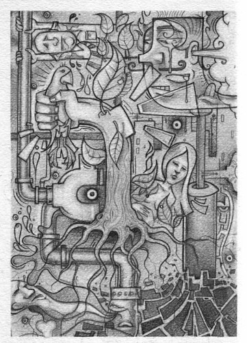
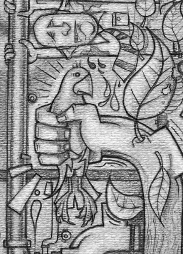
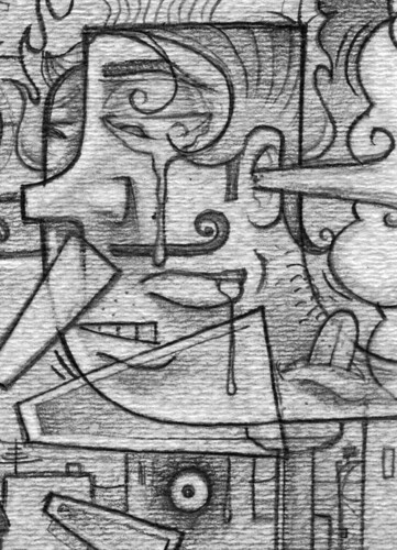
~Guest Artist: Solo RM

check out the homie Solo Rm on his blog and website
solorm.blogspot.com
arempire.com
~Man Creates It, We skates It

Be Golden
BAC
12/31/09
http://brooksbegolden.com
http://brooksblairgolden.blogspot.com
Tangerine in 2010

“Pantone LLC, an X-Rite company (NASDAQ: XRIT), and the global authority on color and provider of professional color standards for the design industries, today announced PANTONE® 15-5519 Turquoise, an inviting, luminous hue, as the color of the year for 2010. Combining the serene qualities of blue and the invigorating aspects of green, Turquoise evokes thoughts of soothing, tropical waters and a languorous, effective escape from the everyday troubles of the world, while at the same time restoring our sense of well being.”
Blah, blah, blah well I'm not buying it. I say Tangerine. 2010 just feels like a tangerine year to me. Anyway, Happy New Year.
Thursday, December 24, 2009
1-800-SKEL-MON
Skeletor applies his mental powers towards a capitalistic venture. Sweetness why you pay $4.99 a minute fee for psychic advice? I, Skel-Mon will give it to you for less than $1 a minute? That's right, less than $1 a minute! Tank you for calling young lady. Dis be Skel-Mon. About 10 months ago accordin' to the 10 of Cups, there was an event with the short stocky man. Don't know what me sayin'? Tink back mon... 10 months ago... I didn't say you knew the stocky man well, but there be a short stocky man. YES te one shaped like a bell!! Tat is te one I talkin' about! Baby... I'm here with bad news for you. The Fool's card has shown to say you often foolish, you foolish to doubt me earlier 'bout the stocky man, you foolish with the stocky man... Caller you ready to continue? You called' me fool-mon. You do not already know dis he did you dirty. My friend, it was your foolishness that let this snake in your grass with out proper cover. You know what I'm talkin' 'bout now. Go take the test, the burning and discoloration is not a coincidence.
Wednesday, December 23, 2009
'Member that episode...


When Skeletor got so fed up with Beast-Mans failures that he started swinging at him with his big ass axe and chopped of his finger tip? C'mon you 'member (humor me here). They looked all over for it so Needle and Thread-Man could sew it back on. Well, they never found it and Beast-Man was surprised as anyone when he eventually grew back a new one. Being a particularity unintelligent minion he was unaware of his ability to regenerate. Nor did he know his missing fingertip, laying just out of site under Skeletors dresser could do a bit of regenerating of it's own. Can you say "spinoff".
Fun Fact: I used to draw pictures of Orko all the time but always colored him purple because in my head I saw him as purple. Why? Because I was too poor to have a color tv and didn't know what color anything was. One day a kid at school called me on it, "Nice drawing, but Orko is red". Silence on my part. I was genuinely shocked.
MOSS MAN
Here is Moss Man, he was my favorite he-man action figure as a kid. cool he-man article, Happy Holidays.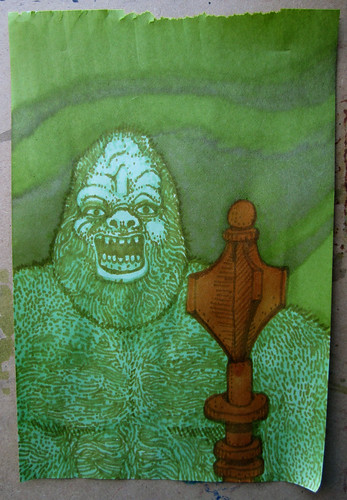

~Skeletor and Orko chillin' (He-man Theme)

Be Golden
BAC
12/23/09
http://brooksbegolden.com
http://brooksblairgolden.blogspot.com
Thursday, December 17, 2009
Flip the script...
This past Tuesday I rented Angles & Demons and after watching it I wanted to try my brain at creating an ambigram of my name. Ambigrams are those typographical treatments that may be read as one or more words not only in its form as presented, but also from another viewpoint, direction, or orientation. In my research I found that this display-type form originated in the late nineteenth century, rendering the stories claim of them dating back some 400 years historically incorrect. The ones featured in the film (earth, wind, fire, water, and illuminati) were created in blackletter by current king-supreme of ambigrams is Mr. John Langdon.
Ambgrams are not mutually exclusive to blackletter-type, they can be created in any style in which the artist is comfortable and/or competent. I did feel the pairing was complimentary and stayed with it. Rather than using contemporary blackletter I used characteristics indicative the late 19th century blackletter based off the of Albion-Gotisch created in 1880 by Hausschnitt Von Benjamin Krebs Nachf. The other type on this page is based off 19th century letterpress. 


and flipped....
Sniff...
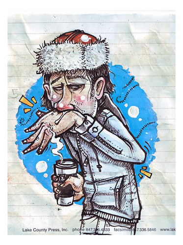 I went through a period of time where I drew a lot of stuff like this. Not so much any more. The big difference is I don't use Design markers anymore as water colors suit my temperament much better and are way more forgiving. They also never dry up so they are definitely one of the more frugal mediums. I just brought an old tooth brush to the office/studio for spattering stuff but I forgot to bring some india ink. I have been wanting to play with india ink for weeks now. I have a huge bottle somewhere.
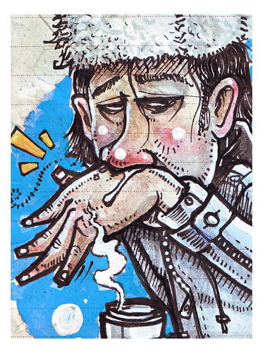
Ink and watercolor and acrylic on paper
The Best Part of Waking up...
I'm going to be in mexico the next two weeks, I'll try to post but I won't have a scanner so we'll see how that goes. Happy Holidays Art people.

~Sweet dreams are made of this...

Be Golden
BAC
12/17/09
http://brooksbegolden.com
http://brooksblairgolden.blogspot.com
Thursday, December 10, 2009
Time for a REBUS

Left the ol' sketch book at home, so I made you a rebus. I'll give the following hint:
The correct phrase is 6 words.
Remember, this is where pictures make a phrase and details have a purpose. See if you can crack it. Enjoy.
Detritus
7'" x 10" pencil on watercolor paper
I consider drawings like these stacking blocks. I just keep them around and work on them whenever, they are never really finished I just get tired of working on them or I forget they exist and they end up in a pile somewhere. No themes no ideas just randomness and visual problem solving, little exercises really. Just found this one the other day. I think the scan shows too much of the texture from the paper it's much more subtle in person.

~You can do it too!... Be a DIPSTK!

Let the fun begin...Be a Dipstk! Join the facebook fanclub!
DIPSTK Facebook
Be Golden
BAC
12/10/09
http://brooksbegolden.com
http://brooksblairgolden.blogspot.com
DOUGH BOY DOODLE
This is a celebrity Sandwich spokesperson getting freaky and revealing his naughtier inner toppings. Beloved Son of Mayor McCheese. He has a true tale to tell. Stay tuned next week for details...
Thursday, December 3, 2009
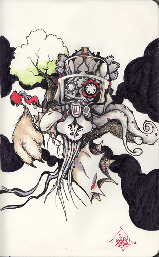
The Creep's Rabid Glare
made use of a few of the stickers I had laying around and made this creep. Finally tried out some weird children's watercolors I purchased at walgreens and believe it or not I'm pretty impressed with their performance. They are all very nontraditional children's paint colors too which is initially why I bought them. Now I just need to find a place to stick this dude.
11" x 6.25" marker, and watercolor on various sticker stickers
Obsessed...
with letter-forms, typefaces, lettering... well the entire universe of typography, my work is very type focused. The majority of my drawings take place during moments of conceptual thinking or brainstorming for clients projects. This tends to leave my personal work in a state of static, never evolving and always pushed off to the side. As of recent I've been re-inspired and feeling the creative juices flowing through my insides. With this change in my body and mind, I have several projects lined up and am very excited to progress and share. Here we have a doodle that developed from the humanistic attributes of the letter "V". The lettering for the V is a unique typeface I recently developed and will be using more frequently. The Heavy-Script paired with the letter is based off 1930s Showcards.

Winter's coming.

5" x 7" ink, watercolor and acrylic on paper
I wasn't sure how this was going to turn out. That's okay though, I don't like a lot of things and my own work is on the list often enough. That being said, even when I feel like something is going south I try to stick with it just in case the next line or brush stroke results in a improvement of some kind, at least improvement enough to keep me motivated enough to see it through. Maybe it's because I was thinking of the long cold Chicago winter ahead and all the salty slush that will soak my feet and leave white powdery continents on the toes of my shoe's or all the wet heavy snow I will be shoveling into piles or... whatever, who knows, either way here it is and I'm kinda happy with it just not sure in what sense. At least I have a warm winter coat which makes all the difference in the world.

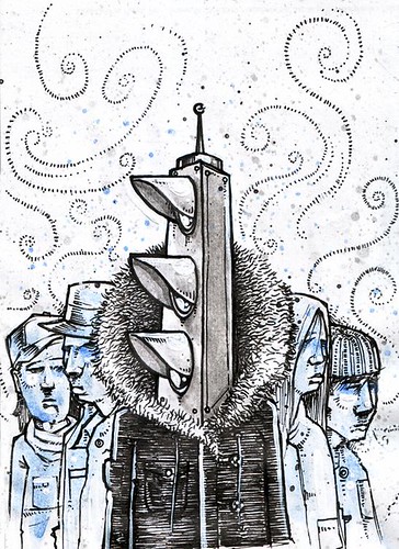
The two above are pre build up and before I added the buildings and junk, which I almost like better, but I really felt like I needed some atmosphere in there.


Subscribe to:
Posts (Atom)
